
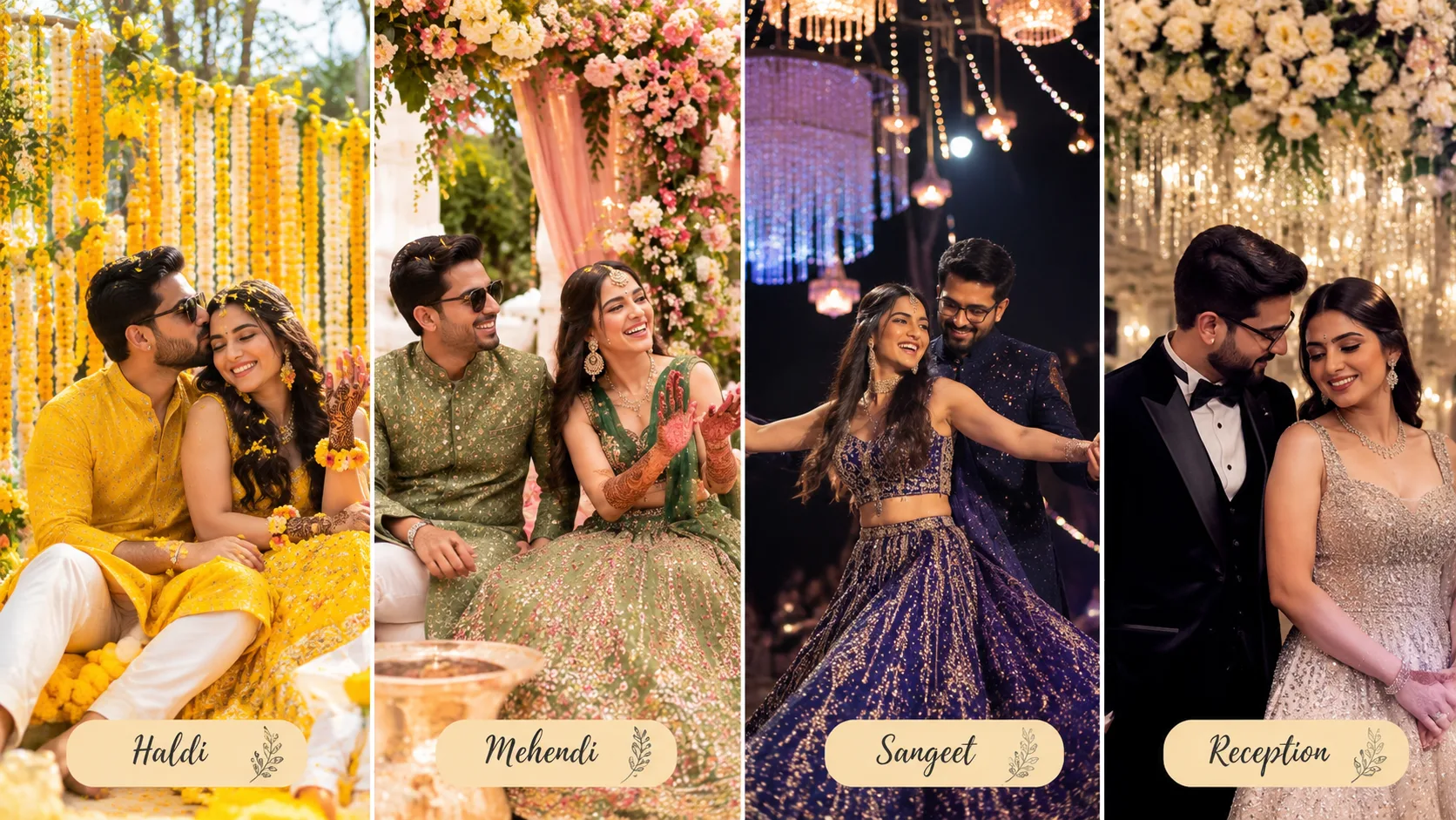
A destination wedding in Dubai gives couples an opportunity to create visually stunning celebrations across multiple functions. From the bright colours of the Haldi ceremony to the elegant atmosphere of the reception, every event can have its own identity while maintaining a beautiful connection with the overall wedding theme.
However, choosing different colours for every function can sometimes make the celebrations look disconnected. On the other hand, using exactly the same colours throughout the wedding may make each event feel repetitive.
The best approach is to select a central colour direction and develop individual combinations for Haldi, Mehendi, Sangeet and reception. This allows each celebration to feel unique while maintaining a consistent visual style.
Here are practical ways to create a beautiful wedding colour palette across all four functions.
1. Start With an Overall Wedding Colour Direction
Before choosing individual colours for each function, decide on the overall visual style of the wedding.
Think about the atmosphere you want to create. Do you prefer traditional Indian colours, soft romantic shades, modern minimalism or rich luxury-inspired decorations?
Some popular colour directions include:
Traditional Indian palette: Maroon, red, mustard, orange and gold. This combination works well for couples who want a strong connection with traditional wedding aesthetics.
Pastel wedding palette: Blush pink, peach, lavender, cream and sage green. These shades create a softer and romantic appearance.
Royal luxury palette: Emerald green, burgundy, champagne, ivory and antique gold. This combination can create a rich and elegant atmosphere.
Modern neutral palette: Beige, ivory, taupe, dusty rose and soft metallic accents. These colours work well for contemporary celebrations.
Jewel-tone palette: Sapphire blue, emerald green, ruby red and deep purple. This direction is suitable for couples who prefer bold and dramatic styling.
Select a main colour direction and use it as the foundation for the individual function palettes.
2. Choose Bright and Festive Colours for the Haldi Ceremony
The Haldi ceremony is often one of the most colourful pre-wedding celebrations. Its décor should feel cheerful, welcoming and connected to the traditional use of turmeric.
Yellow is a natural starting point, but combining it with complementary shades can make the decorations more interesting.
Consider these combinations:
- Yellow and white: A fresh combination for a bright and simple celebration.
- Mustard and orange: Suitable for a rich traditional Indian theme.
- Yellow and pink: Adds a playful and cheerful appearance.
- Yellow and green: Creates a lively atmosphere with a natural floral feel.
- Yellow and peach: A softer alternative for a contemporary Haldi setup.
For decorations, consider marigold garlands, colourful fabric draping, floral seating arrangements and traditional decorative elements.
The bride and groom's outfits can complement the décor without being exactly the same shade.
For example, the bride may wear a light yellow lehenga while the groom chooses an ivory kurta with mustard details.
3. Select Fresh and Vibrant Colours for the Mehendi Ceremony
Mehendi celebrations often involve colourful outfits, henna designs, music and relaxed gatherings. The colour palette can be slightly more playful than the wedding ceremony or reception.
Some attractive combinations include:
Green and pink: A popular combination that works well with floral decorations and colourful seating.
Orange and fuchsia: Suitable for an energetic celebration with bold Indian-inspired details.
Mint green and peach: Creates a soft and refreshing atmosphere.
Purple and yellow: Adds contrast and a lively visual appearance.
Coral and turquoise: A bright combination for couples who prefer contemporary styling.
Decor elements can include colourful cushions, floral backdrops, patterned fabrics, decorative umbrellas and coordinated seating.
Consider how the bride's Mehendi outfit will appear against the background. Choosing contrasting shades can help her stand out in photographs.
4. Create a Glamorous Colour Palette for the Sangeet Night
The Sangeet is usually one of the most energetic wedding celebrations. Its colour palette can be more dramatic and glamorous, especially when the event includes performances, dance floors and evening entertainment.
Consider these combinations:
- Navy blue and gold: Creates a sophisticated evening appearance.
- Burgundy and champagne: Adds a rich and elegant atmosphere.
- Purple and silver: Works well with contemporary stage lighting.
- Emerald and metallic gold: Creates a bold luxury-inspired look.
- Black and rose gold: Suitable for a modern evening celebration.
For Sangeet decorations, coordinate the stage backdrop, dance floor, lighting, table décor and performers' outfits.
Avoid using too many competing colours in the same area. A strong main colour with one or two supporting shades usually creates a more polished appearance.
Also consider the outfits worn by the bride and groom. Their colours should remain visible against the stage and background rather than blending into the decorations.
5. Choose Elegant and Timeless Colours for the Wedding Reception
The reception often has a more formal atmosphere than the pre-wedding functions.
This is an opportunity to introduce refined colour combinations that complement the couple's outfits and the venue's interiors.
Some elegant combinations include:
Champagne and ivory: A soft and sophisticated choice for a luxury reception.
Burgundy and gold: Suitable for couples who prefer a rich traditional look.
Sage green and white: Creates a fresh and contemporary atmosphere.
Dusty rose and silver: Offers a romantic visual style.
Emerald and champagne: Combines rich colour with subtle elegance.
Use the selected palette across the reception stage, table arrangements, floral installations, entrance decorations and lighting details.
You can also introduce metallic accents through candleholders, table accessories, signage and decorative structures.
The aim is to create an elegant visual environment without overwhelming the venue.
6. Maintain a Consistent Colour Connection Across All Functions
Although each celebration can have its own palette, there should be some visual connection between them.
Without consistency, different functions can look like separate events rather than parts of one wedding celebration.
You can maintain continuity by:
- Using one recurring accent colour across all functions.
- Keeping similar floral styling where appropriate.
- Repeating selected metallic details.
- Using consistent invitation and stationery designs.
- Maintaining a similar approach to typography and signage.
- Coordinating the bride and groom's outfits with the overall wedding direction.
For example, a wedding may use gold as a recurring accent throughout the celebrations.
The Haldi could feature yellow and white with gold details, Mehendi could combine green and pink with gold accents, Sangeet could use navy and champagne, and the reception could feature ivory and gold.
This creates variety without losing the overall wedding identity.
7. Coordinate Wedding Flowers With the Colour Palette
Flowers are an important part of Indian wedding décor. Their colours can influence the appearance of the mandap, entrance pathway, table arrangements and photo backdrops.
Choose flowers according to the function's colour direction and the overall design.
Consider:
- Yellow and orange flowers for Haldi.
- Pink, purple and white flowers for Mehendi.
- White, burgundy or jewel-tone arrangements for Sangeet.
- Ivory, blush and champagne-inspired floral combinations for reception.
Ask your decorator which flowers and suitable alternatives can be sourced for the event dates.
Also consider the size and placement of floral installations. A large floral backdrop may need a slightly simpler surrounding décor to avoid making the space look overcrowded.
For outdoor celebrations in Dubai, discuss flower care, storage and temperature management with the florist.
8. Consider Dubai Venue Interiors and Lighting Before Finalising Colours
A colour palette that looks beautiful in a design reference may appear different inside the actual venue.
Hotel ballrooms, outdoor terraces, gardens and beachfront settings have different backgrounds and lighting conditions.
Before approving the final décor, consider:
Indoor ballrooms: Warm lighting can affect how ivory, beige, gold and pastel shades appear.
Outdoor gardens: Natural greenery may influence the appearance of pink, yellow and white floral arrangements.
Beachfront venues: Blue water, open skies and sunset lighting can complement lighter and softer colour combinations.
Luxury hotel interiors: Existing carpets, wall finishes, chandeliers and furniture may influence the overall colour scheme.
Ask the decorator to share fabric samples, floral references and lighting previews before finalising the setup.
Where possible, review the selected colours in the actual event space rather than relying only on digital inspiration images.
9. Match the Bride and Groom's Outfits With Each Function's Décor
The wedding colour palette should also influence the couple's clothing choices.
Their outfits do not need to match the stage or decorations exactly. Instead, select complementary colours that create a balanced appearance.
For example:
- For Haldi, consider yellow, ivory or pastel outfits.
- For Mehendi, explore green, pink, orange or colourful Indo-western designs.
- For Sangeet, consider navy, burgundy, emerald or metallic accents.
- For the wedding ceremony, select traditional colours that reflect the couple's preferences.
- For reception, consider champagne, ivory, black, silver or jewel tones.
Coordinate with the designers so that the bride and groom's outfits remain visually distinct from the background.
Also share outfit references with the decorator and photographer before finalising the event design.
10. Use a Colour Palette Reference to Guide Every Wedding Vendor
Once the colours have been selected, prepare a simple visual reference that shows the approved shades and their intended use.
This is important because different vendors may interpret colour descriptions differently.
For example, one person may consider blush pink a soft pastel, while another may choose a much brighter pink fabric.
Your reference should include:
- Main colours for each function.
- Supporting and accent shades.
- Flower and fabric references.
- Stage and table decoration inspiration.
- Bride and groom outfit references.
- Lighting preferences.
- Colour combinations that should be avoided.
Share the same approved reference with the wedding planner, decorator, florist, lighting team, stationery designer and stylist.
This helps everyone work towards the same visual direction and reduces the possibility of mismatched decorations.
11. Avoid Common Wedding Colour Palette Mistakes
Even attractive colours can look unbalanced when they are not planned properly.
Avoid these common mistakes:
Using too many main colours: Too many dominant shades can make the décor look visually confusing. Choose a small group of colours and use additional shades selectively.
Ignoring the venue background: A colour that works in one ballroom may not suit another venue's existing interiors.
Matching every outfit exactly with the décor: The bride and groom should remain visually noticeable rather than blending into the backdrop.
Ignoring lighting conditions: Check how colours appear under the venue's actual lighting before approving the setup.
Choosing colours only from online photographs: Digital images may look different depending on screen settings, editing and photography conditions.
Changing the palette at the last minute: Late changes can affect floral orders, fabric purchases, outfits and vendor preparation.
A clear visual plan can prevent many of these issues.
Wedding Colour Palette Planning Checklist
Before approving the decorations, confirm the following:
- Overall wedding colour direction selected.
- Separate palettes finalised for Haldi, Mehendi, Sangeet and reception.
- Recurring accent colour selected.
- Bride and groom outfit colours coordinated.
- Floral arrangements selected.
- Stage and entrance décor references prepared.
- Venue interiors and lighting considered.
- Fabric and colour samples approved.
- Photographer's input considered.
- Final colour references shared with all vendors.
Frequently Asked Questions
1. How do couples choose colours for different Indian wedding functions?
Start with an overall wedding colour direction and select individual combinations according to each function's atmosphere. Haldi can use bright yellow shades, Mehendi can feature vibrant colours, Sangeet can have dramatic combinations and reception can use elegant tones.
2. Should all wedding functions have the same colour palette?
No. Each celebration can have its own colour combination. However, using a recurring accent colour, consistent floral styling or similar decorative details can create visual continuity.
3. Which colours work best for an Indian Haldi ceremony?
Yellow is a natural choice, while orange, white, pink, green and peach can be used as supporting colours depending on the theme.
4. What are suitable colour combinations for a Mehendi ceremony?
Green and pink, orange and fuchsia, mint and peach, purple and yellow, and coral and turquoise are possible combinations.
5. Which colours create an elegant Sangeet atmosphere?
Navy and gold, burgundy and champagne, emerald and metallic gold, and purple with silver can create a glamorous evening appearance.
6. How can couples choose reception décor colours?
Consider the venue interiors, lighting, couple's outfits and overall wedding style. Champagne, ivory, emerald, burgundy, blush and gold are possible options.
7. When should couples finalise their wedding colour palette?
Finalise the main colour direction early enough for outfit selection, floral sourcing, décor design and vendor coordination. This also gives the team time to test samples before approving the final setup.
8. How can couples ensure all wedding vendors follow the same colour palette?
Prepare a visual reference with approved shades, fabrics, floral inspiration and outfit photographs. Share it with all relevant vendors and request approval of samples before production or installation.
Final Thoughts
A beautiful wedding colour palette is not about using the same shades everywhere. It is about creating a visual connection between different celebrations while allowing each function to express its own personality.
With thoughtful planning, every function can look distinctive while still feeling like part of one beautifully connected wedding celebration.