
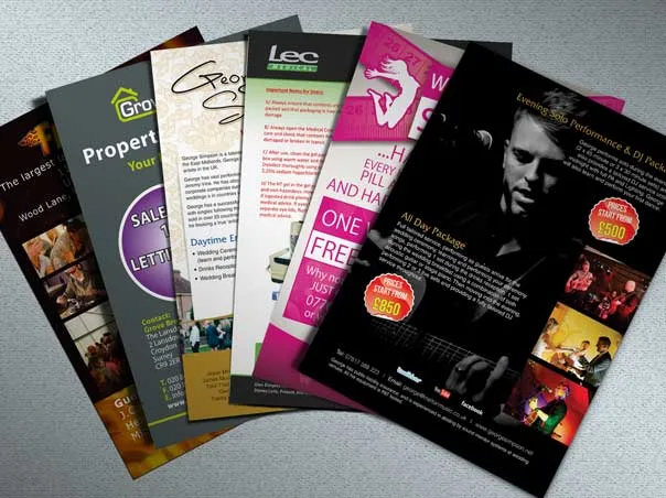
Even in this digital age, brochures remain a powerful marketing tool as they offer a trusted, focused experience and have the power to convert readers into buyers. To make the most out of brochures, they need to be designed and printed in such a manner that readers understand what they have to do with it in the ten seconds before it lands in their bag or a bin. Getting custom brochure printing right from the beginning can create a brochure that converts customers into actual buyers of your service.
Start With the Fold, Not the Copy
Most people write the content first and figure out the layout after, which backfires the moment a paragraph doesn't fit the panel it was written for. A tri-fold gives six workable panels and reads well for step-by-step information - services offered, process, pricing. For custom brochure printing, a bi-fold works better for something visual and less text-heavy, like a menu or a single-product showcase. Z-folds and gate-folds suit designs built around one strong central image rather than several sections of copy. Deciding on the fold before drafting a single line saves a redesign later.
The Cover Still Decides Everything
Whatever's on the front panel decides whether the brochure gets opened or set down. A logo alone isn't enough - the cover needs one clear visual that tells a reader what they're about to learn, plus the name and mark so the association sticks. This is where a lot of brochures lose the room before the interior copy even gets a chance.
Resolution Problems Show Up at the Worst Time
Images pulled from a website or a phone often look fine on screen and blurry on paper. Print resolution runs higher than screen resolution - 300 to 350 dpi is the target for anything going to press, and catching this before the file ships saves a reprint. It's a small technical detail that causes a disproportionate number of brochure complaints.
Write for Panels, Not Paragraphs
Brochure copy reads differently than a webpage. Each panel needs to stand on its own, since a reader might flip straight to the middle without reading the cover copy first. Short, scannable sections beat dense paragraphs almost every time - features and benefits broken into a few lines per panel, not one long block of text trying to cover everything at once.
Glossy stock makes colors pop and photographs well, which suits product-heavy brochures. Matte has a quieter, more premium feel and handles text-heavy layouts without glare. Neither is objectively better - the choice depends on whether the brochure leans visual or informational.
It's easy to spend all the design energy on the cover of your custom brochure printing and treat the back panel as an afterthought. That's usually where contact details, a QR code, or a simple next step belong - something concrete for a reader to do once they've made it through the rest of the piece, rather than trailing off with no clear direction.
A well-designed brochure that sits in the box does nothing. So, the distribution of these brochures matters a lot, along with the distribution medium you use. If you are going for direct mail, it has a different distribution style, while if you go for trade show handouts, you need a different approach. So, before you finalise any printing specs, it's best that you become sure of the distribution method.
Final Thoughts
Brochure printing services built around these details - correct resolution, fold-appropriate copy, and paper suited to the piece - tend to produce brochures that actually get read instead of glanced at once and discarded.
Universal Print and Copy has been serving Los Angeles businesses since 2000 and is a highly renowned print shop that prints brochures, catalogues, and short-run marketing materials with high-quality services and fast turnaround.