When you walk into a restaurant, your first impression isn't just about the smell of the food or the lighting. It's about the entire atmosphere, and one often-overlooked component of that experience is the menu. A well-designed menu that aligns with your restaurant's theme can significantly enhance the dining experience, subtly reinforcing your brand and helping guests connect more deeply with your vision. It’s not just about listing dishes; it’s about communicating your restaurant’s identity through visual and textual cues.
Here are key tips to help you match your menu design with your restaurant theme effectively.
1. Understand Your Brand Identity
Before diving into typography or layout, take a step back and define your restaurant’s brand identity. Are you running a rustic farmhouse-style bistro, a sleek modern sushi bar, or a vibrant Mexican taqueria? Your brand identity includes your cuisine, target market, color scheme, and even the emotions you want your guests to feel. A strong understanding of this identity will act as the foundation for all menu design choices. Think of your menu as an ambassador of your restaurant’s personality—it should speak the same language.
2. Use Colors That Reflect Your Theme
Color psychology plays a crucial role in setting a tone. If your restaurant theme is calm and minimalist, such as a Scandinavian café, neutral tones like soft grays, whites, and light woods will reflect that feel. For an Indian restaurant bursting with culture and spice, rich reds, oranges, and golds can evoke warmth and flavor. Choose a palette that mirrors your space's walls, furniture, and lighting to create visual cohesion. The goal is to make the menu feel like a natural extension of the environment, not an afterthought.
3. Typography That Speaks Volumes
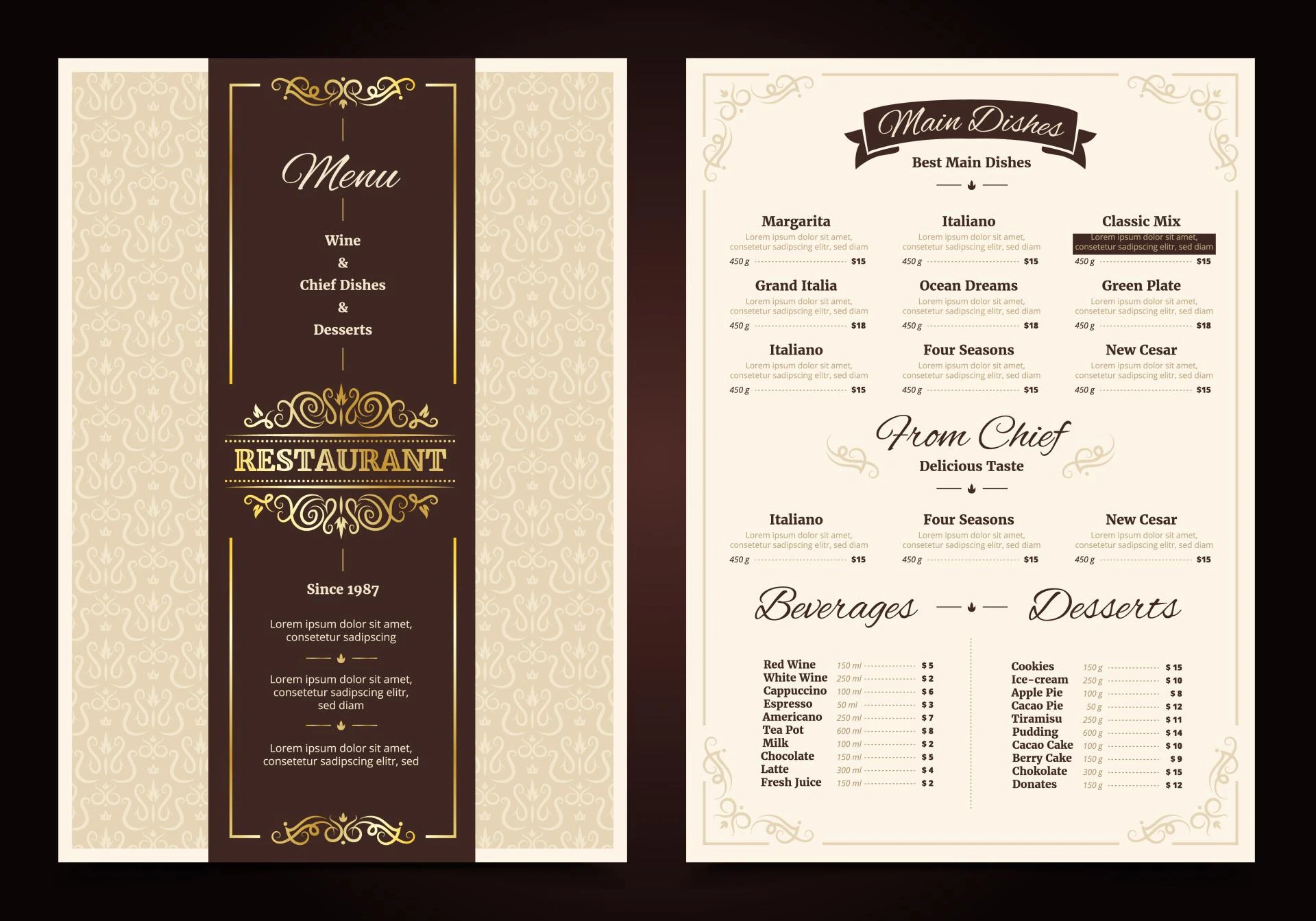
Fonts convey mood. A menu for a high-end French restaurant might use elegant serif fonts with fine details, while a retro diner could benefit from bold sans-serif typefaces or even vintage-inspired lettering. Choose one or two fonts that suit your theme and maintain consistency throughout the menu. Avoid mixing too many typefaces—it can be distracting and confusing. Legibility is also critical, so be sure to balance style with readability. No matter how beautiful a script font is, it shouldn't make your guests squint to read the entrée list.
4. Material Matters
Think beyond paper. The material of your menu can say as much as the words printed on it. A leather-bound menu exudes luxury and class, perfect for upscale steakhouses or wine bars. Wooden boards might be ideal for rustic or organic-themed establishments. For casual eateries or food trucks, laminated menus or chalkboard specials could be more appropriate. Even digital menus can be tailored with custom-designed interfaces that match your restaurant’s vibe. Your menu’s physical texture should complement the overall ambiance, adding a tactile experience that reinforces your brand.
5. Layout and Structure Reflect Experience
The way your menu is organized should mimic the kind of dining experience you offer. A tasting-menu-only fine dining restaurant might use a minimal, single-page format that lists items in a fixed sequence. In contrast, a family-style eatery may benefit from multi-page booklets categorizing starters, mains, sides, and desserts separately. Consider using visual hierarchies—such as bold headings or boxed specials—to guide the diner’s eye naturally and emphasize certain items. This also makes it easier for customers to find what they’re craving.
6. Menu Size and Shape Are Strategic
Size and shape should be functional, but they also carry thematic weight. A compact, square menu can suggest modernity and efficiency, suitable for a trendy urban café. Large, fold-out menus with many sections might better suit a bustling diner or international buffet. Keep in mind the dining environment—space on the table, lighting conditions, and even the average time guests spend at the table. The menu should feel comfortable in hand and easy to handle, not like an awkward prop.
7. Match Imagery to Atmosphere
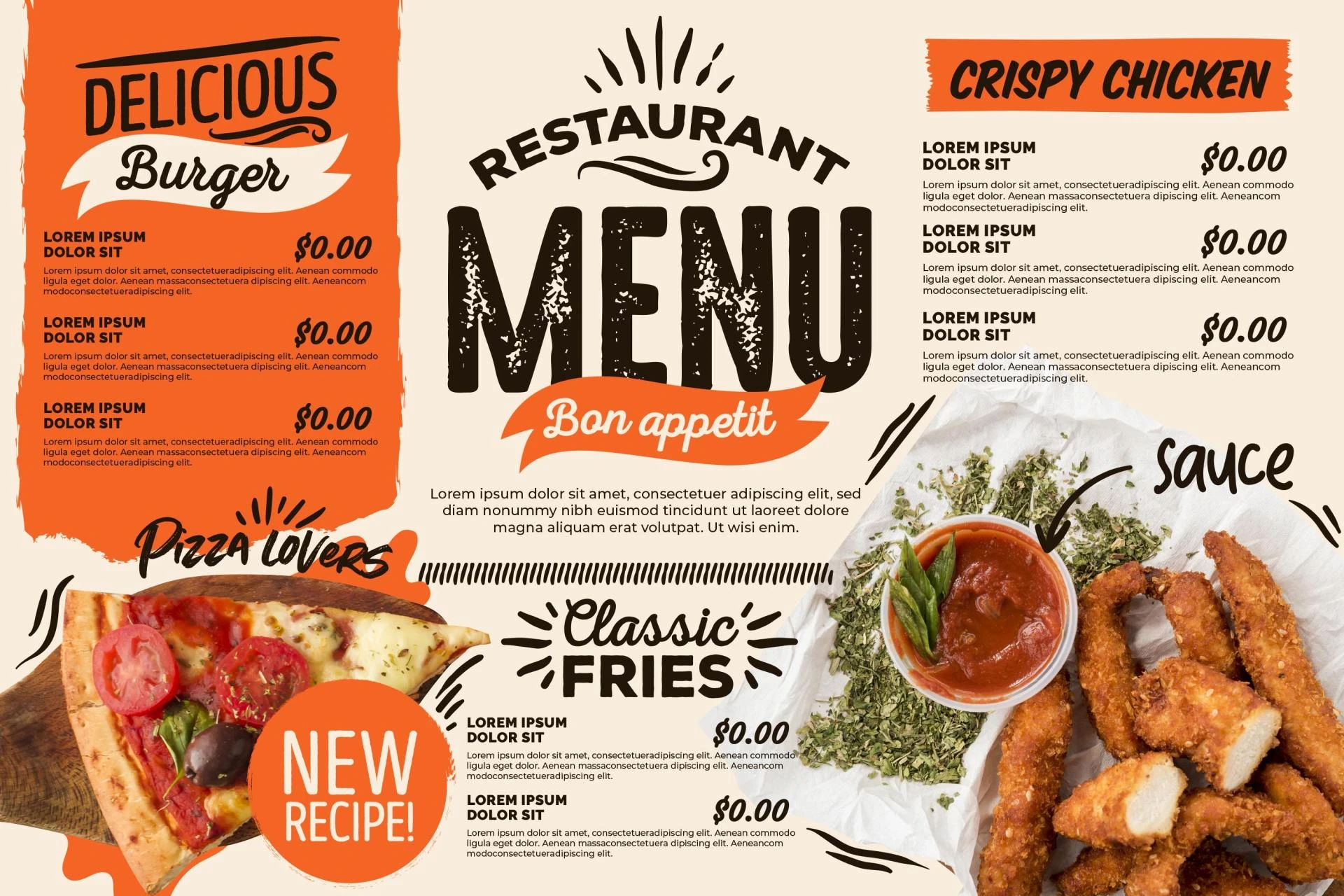
If you choose to include images on your menu, they must be high quality and in tune with your theme. Artistic illustrations might suit a bohemian brunch spot, while minimal or no images might be best for an upscale or serious culinary venue. If using photographs, ensure they are professionally shot and color-corrected to avoid looking amateurish. Images should feel like a natural part of the layout, not just decorative filler.
8. Language and Tone Should Be Consistent
The words on your menu are just as important as the visuals. The language you use—whether it's poetic, playful, or strictly factual—should reflect your brand’s voice. A luxury Italian restaurant might use elegant descriptions in Italian with English translations, while a casual burger joint could use slang and humor. Consistency in tone shows intentionality and professionalism. Don’t let your tone veer off course mid-menu; if your appetizer section is cheeky and informal, the desserts shouldn’t suddenly read like a science journal.
9. Seasonal or Rotating Menus Require Design Flexibility
If your menu changes frequently—due to seasonal ingredients or weekly specials—consider designs that allow for easy updates without sacrificing style. Clipboards, chalkboards, or printed inserts can be swapped out effortlessly while keeping the core theme intact. This approach is particularly useful for farm-to-table restaurants or places with market-driven menus. Design your base menu with these adjustments in mind so changes feel seamless and organic, not like an afterthought.
10. Consistency Across All Touchpoints
Your menu doesn’t exist in isolation—it’s part of a larger ecosystem that includes signage, tableware, staff uniforms, and your digital presence. Make sure your restaurant menu design aligns with the look and feel of your website, social media, and promotional materials. When everything flows together, it builds a strong, trustworthy brand image that guests are more likely to remember and recommend. A customer who sees your brand identity reinforced at every step—from online booking to table service—is more likely to feel immersed in your concept.
11. Consider the Psychology of Choice
Design is not just aesthetics; it also influences behavior. Grouping items, using boxes or highlighting chef’s picks can subtly direct diners’ attention. Strategic placement—like putting profitable dishes in the top-right corner—can guide choices without overt manipulation. This subtle design psychology works best when it feels effortless, serving the customer’s needs while supporting your business goals. Matching your theme with these visual strategies ensures they feel natural and not salesy.
12. Test, Observe, and Adapt
Finally, don’t treat your menu as static. Observe how customers interact with it. Do they linger over certain sections? Ask many questions about specific items? Leave feedback about readability? These are clues. Gather insights from your staff as well—they’ll know which parts of the menu work and which create confusion. Regularly update and refine your menu design to improve flow, alignment, and relevance. A menu that evolves with your restaurant keeps the experience fresh and exciting for repeat customers.
Conclusion
Designing a menu that matches your restaurant theme is about harmony. From colors and fonts to layout and language, every detail should echo the essence of your brand. When done thoughtfully, your restaurant menu design becomes more than a list of food—it becomes a storytelling tool that captures your restaurant’s soul and enhances every guest’s dining journey. By aligning the menu with your overall theme, you create a cohesive, immersive experience that keeps customers coming back for more.